Reimagining a LegacyModernizing a brand without losing its Mission
IMB: A brand rooted in faith, evolving for the future
Below: Previous International Mission Board logo:

For decades, the International Mission Board—known to most simply as “IMB”—has served as a trusted guide in the global mission field.
Finding the connectionWhat the research told us
Through a comprehensive mix of qualitative and quantitative research, one word kept bubbling up again and again—unprompted, uncoached, and across every audience we listened to: Connecting.
Whether it was donors, field staff, or church partners, everyone used this word when describing IMB’s value. It became clear: Connecting wasn’t just a sentiment—it was the brand. We elevated this insight to become the new tagline and organizing principle for the brand system.
Simpler, stronger, more human
Visual identity can speak volumes. After exploring hundreds of options, we arrived at a clean, typographic lettermark. The choice? Strategic. It removed unnecessary ornamentation and let the name—and the mission—shine through. No more institutional visuals. No more complexity. Just clarity and confidence.
But like any organization with deep roots and far-reaching impact, IMB came to a crossroads: How do you stay true to a legacy while speaking clearly to a new generation?
That’s where we came in. Our challenge was to update IMB’s brand identity in a way that respected its heritage while positioning it for growth—culturally, digitally, and globally.
Above: The logo and tagline selected to represent the cornerstone of the new IMB brand:

Same Godly mission.
New glorious look.
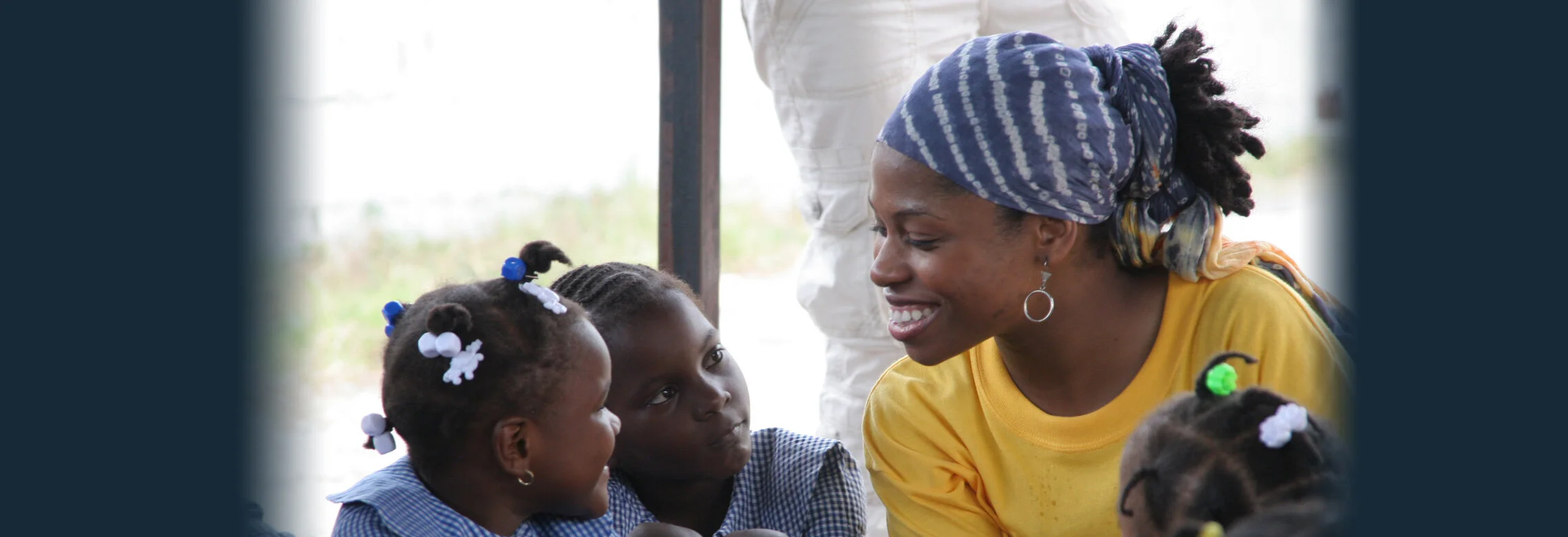
Pictured: Rich — IMB Missionary
Brand Tiers
IMB programs and audiences vary dramatically. What is designed for one program may not be as effective, or even culturally appropriate for a region or audience in a different part of the world.
For this reason, we developed multiple Brand Tiers that categorized and guided people on the type of visual language and graphic representation to be incorporated into various IMB communications:
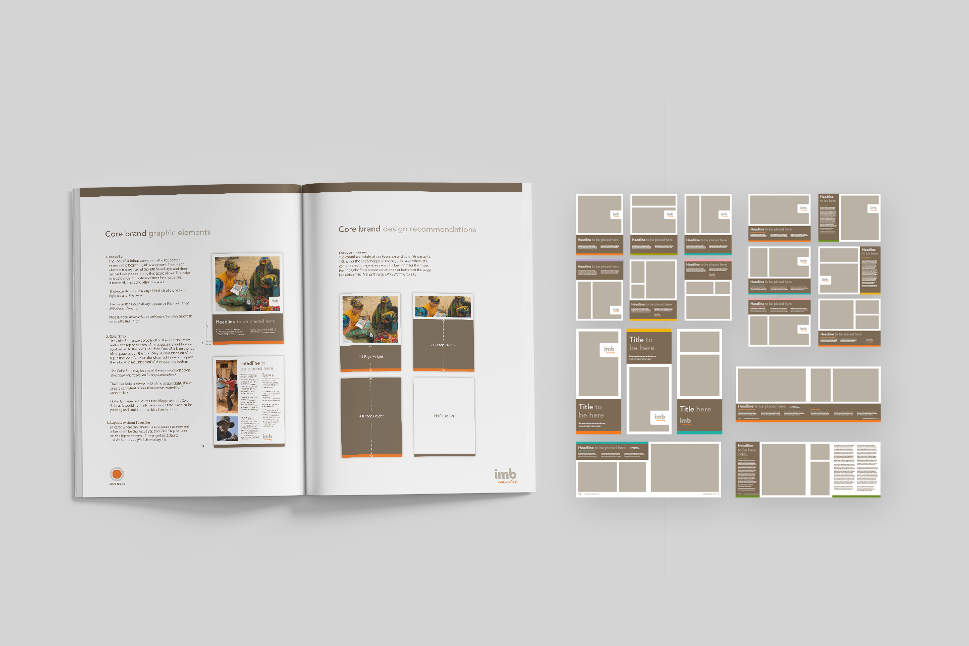
Core Brand
Regional Brand
Tailored Brand
No Brand

1. Core Brand
The clean visual approach of the Core Brand was the primary visual brand language used on the majority of IMB’s brand communications. It was intentionally structured in a systematic manner that would be easy to templatize and recreate on nearly any design and publishing platforms by people of varying design skillsets.
Additionally, when we realized the caliber of the IMB Photography organization (many of whom had worked at industry leaders such as National Geographic), we didn’t want the visual design of the brand components to overpower or ‘get in the way’ of their powerful storytelling imagery and the compelling copy that accompanied it.


2. Regional Brand
IMB is a global organization that segments audiences, and teams that support them, into geographic Affinity Groups. Each Affinity Group speaks to a different cultural audience. Not only was it important to these groups to feel ownership of a unique identity for their region, it was also felt that a visual language that works in one culture may not appeal to another.
The challenge of provide a cohesive look and feel across IMB communications while honoring the cultural roots of each group.
Regional Palette Libraries
With careful consideration and design strategy, we developed unique libraries of color palettes, textures, and images were developed for IMB’s eight global regions – ensuring that they complemented the Core Brand, while giving them the tools they needed for their unique and culturally appropriate identities.

3. Tailored Brand
To better target to specific demographics such as Youth and Teen audiences, a few products, experiences, and events had to be customized. Our approach entailed creating visual design language strategies and executions that honored the spirit of the Core Brand while also appealing to and connecting with the younger generation, making them feel more engaged and intrigued.

4. No Brand
In an unusual move for a brand strategy and design agency, we also created guidelines for refraining from using visual brand language in regions where IMB's Christian beliefs might not be well-received.
This allowed us to be sensitive to local cultures and beliefs while ensuring the safety of the missionaries remained a crucial aspect of continuing the organization's work.
This wasn’t just a visual refresh. It was a strategic realignment—connecting IMB’s identity to the full weight of its impact. We helped an established organization bridge the gap between its rich legacy and the needs of today’s global audience, laying the groundwork for deeper engagement, clearer messaging, and a future filled with possibility.
IMB’s mission is too meaningful to get muddled. Their new brand doesn’t just look the part—it speaks with clarity, heart, and purpose. It brings forward what’s always been true: a commitment to connecting people, cultures, and communities through faith.
To bring this vision to life, we worked hand in hand with teams across the organization. Together, we developed and rolled out hundreds of brand-aligned tools—from traditional print pieces and digital assets to video storytelling and global marketing campaigns. Every element was built to help IMB communicate more effectively, reach more people, and extend the message of Christ around the world.
The team
Creative Director:
Kevin Flores
Brand Strategist:
Kevin Flores
Art Director:
Jordan Schmidt
Art Director:
Whitney Tucker
Senior Designer:
Jared Boggess
Account Director:
Sarah Sheldon